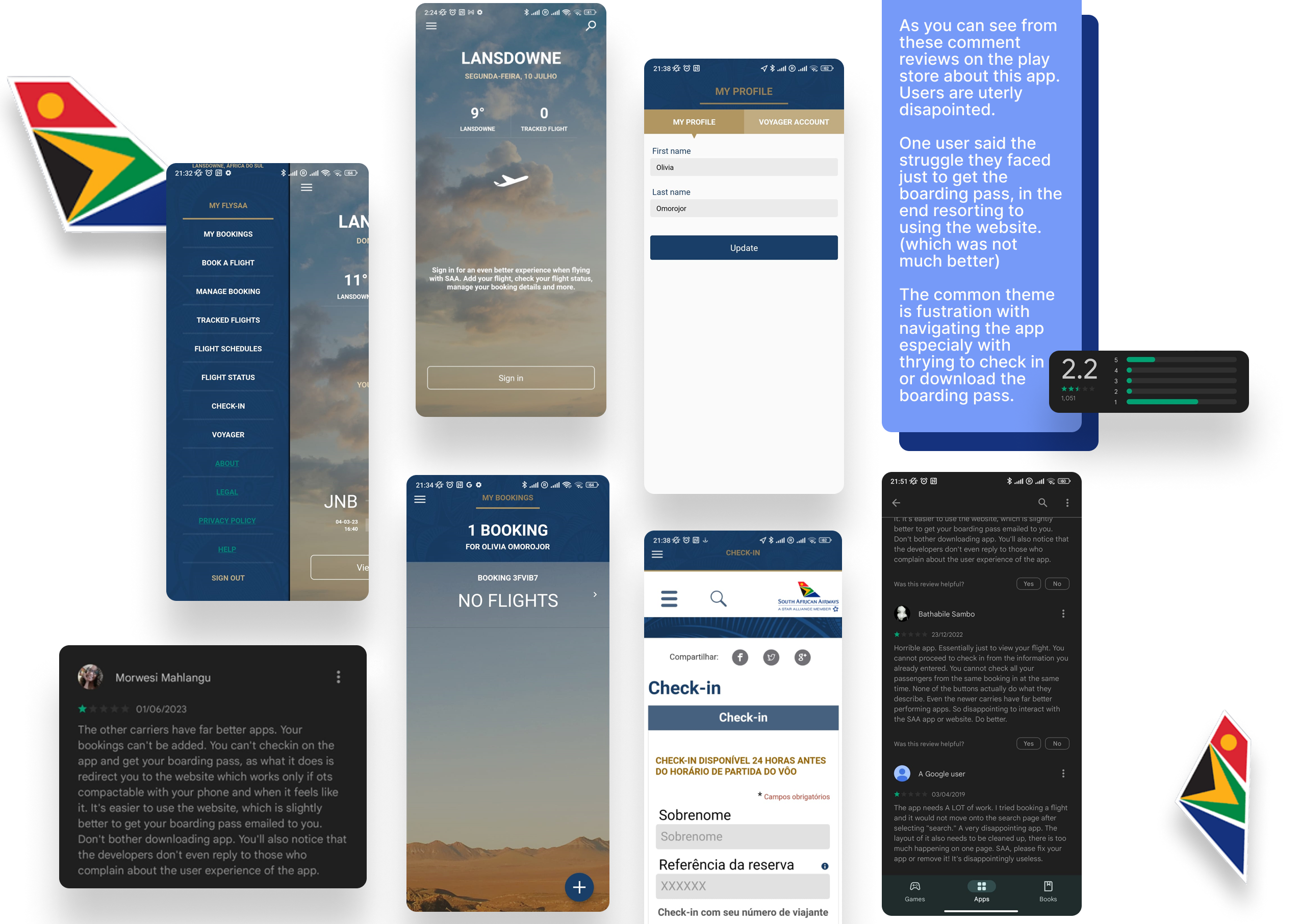
I decided to redesign the South AfricanAirways airline application. Having used it before, I really found it one of the worst airline apps I had ever used.
First, when I wanted to add 'mybooking' before the day of the flight so that it would be easy to check in, it was hard to find the menu and page to add my booking, and I had to click on afew options before I found it.
Then when it was time to check in, it would open the website within the app which was very messy and buggy. The UI also was not pleasant or cohesive. So I decided to create a clean easy to navigate app.
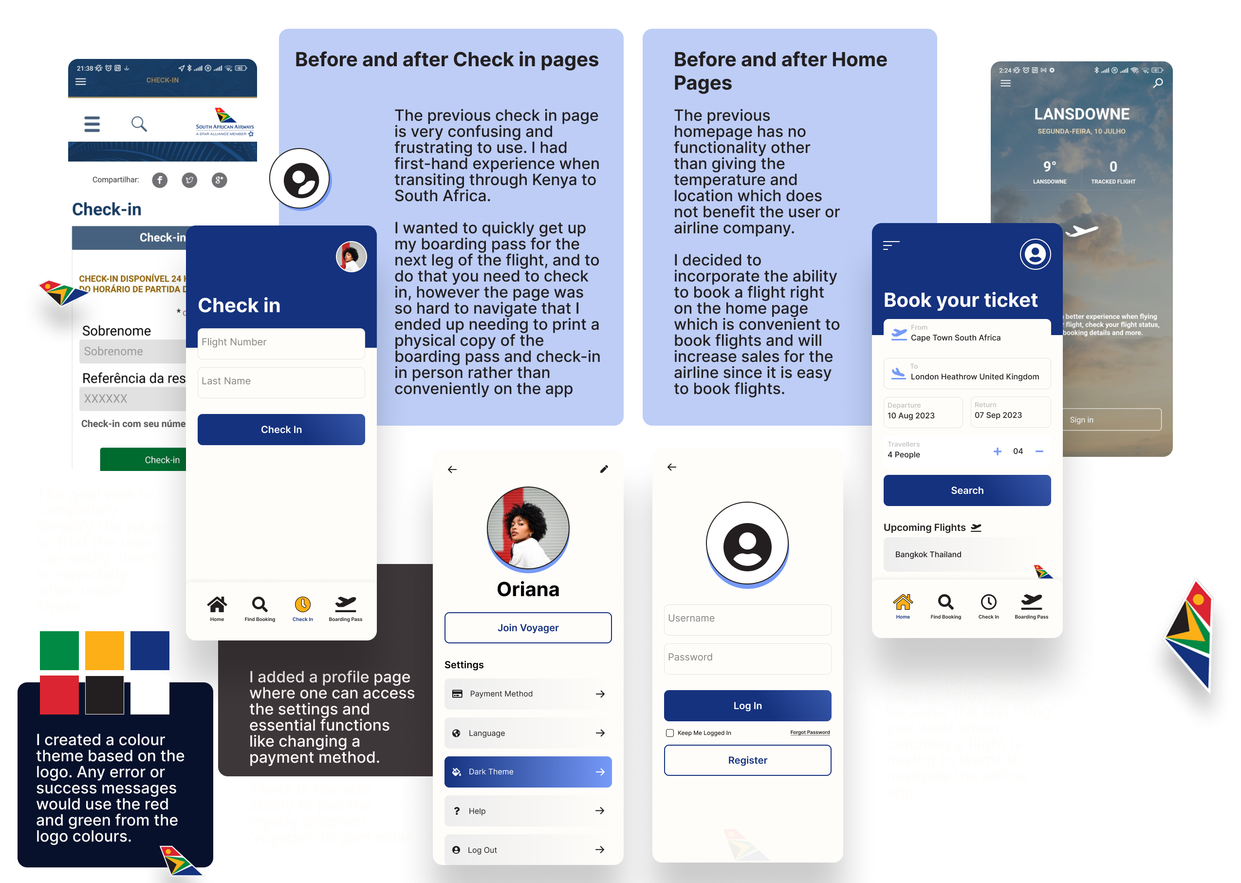
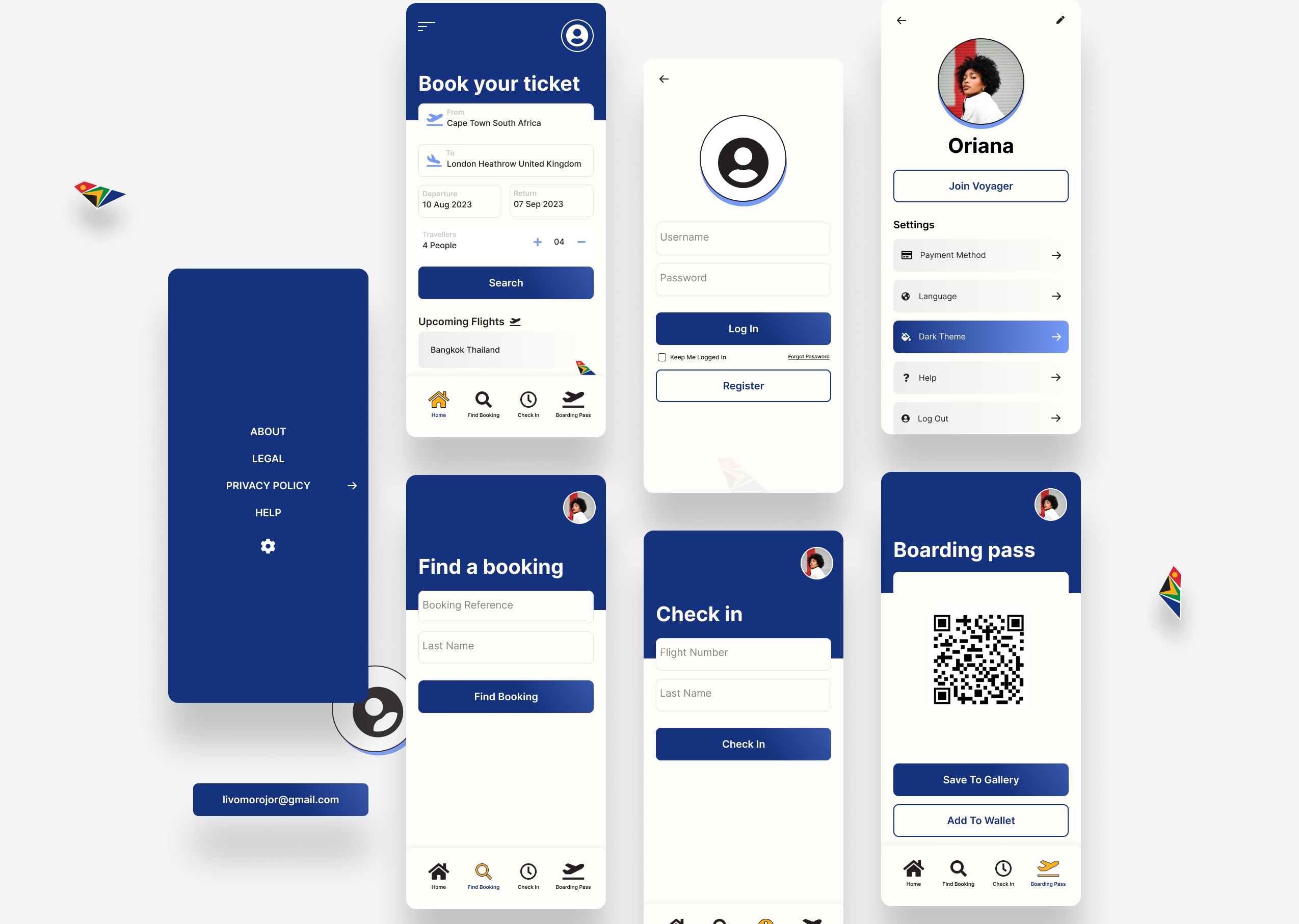
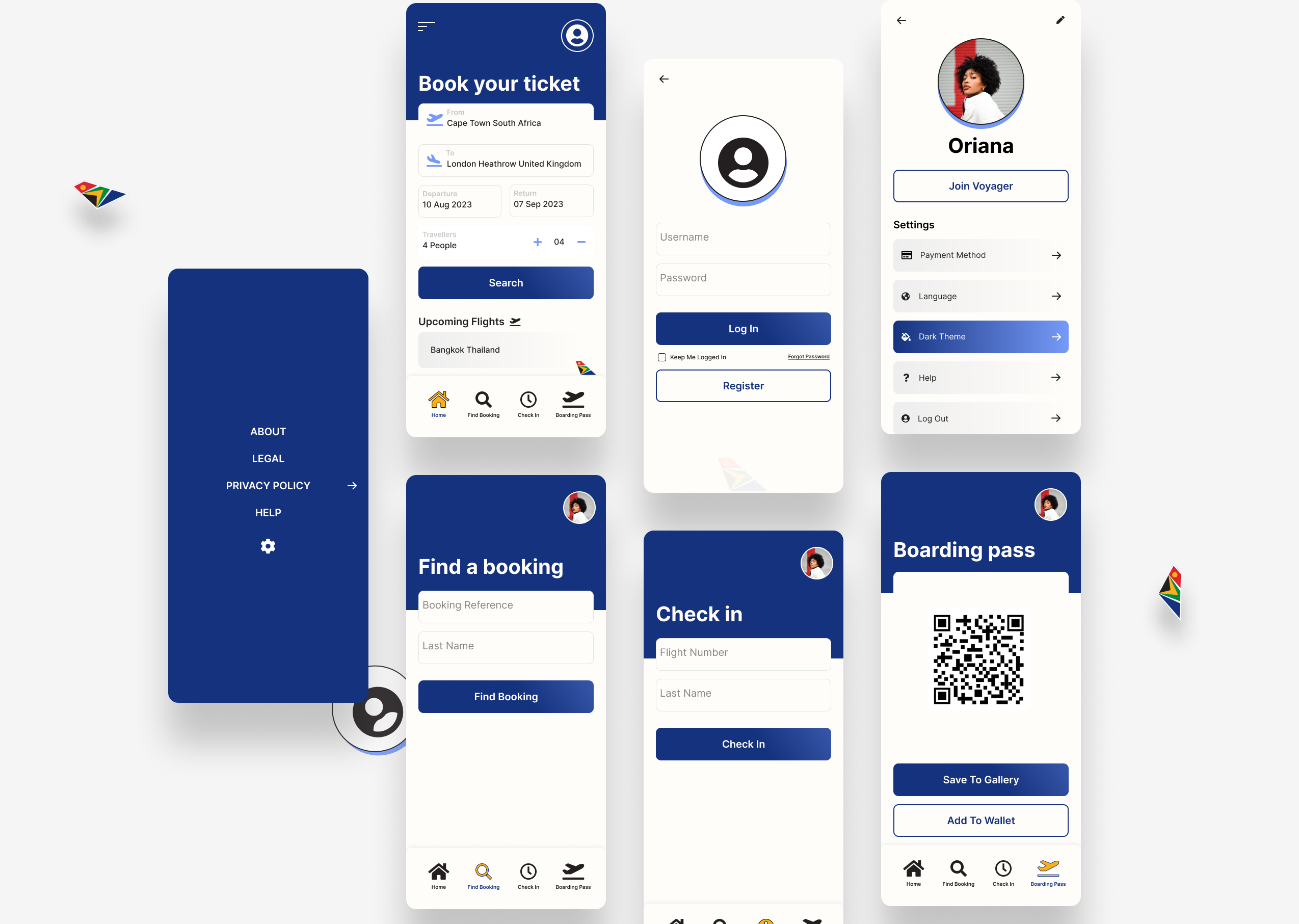
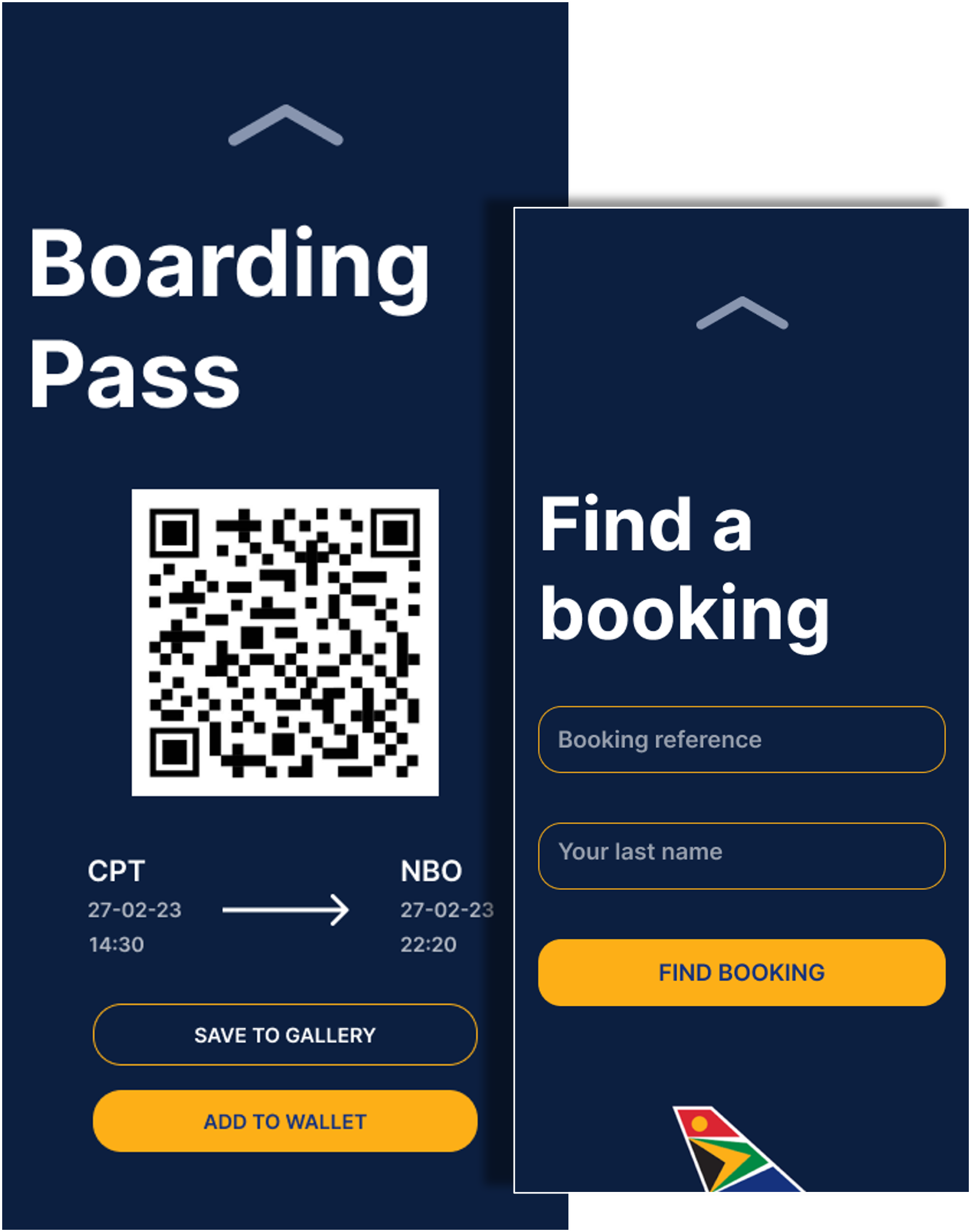
The main objective for downloading and using an airline app is to facilitate your boarding process. Most users just want to easily add their trip to the itinerary and then check in online up to 24 hours before the flight. With this in mind, I decided to make the homepage easy to access these key functions. Finding the booking, checking in, and having access to boarding passes.
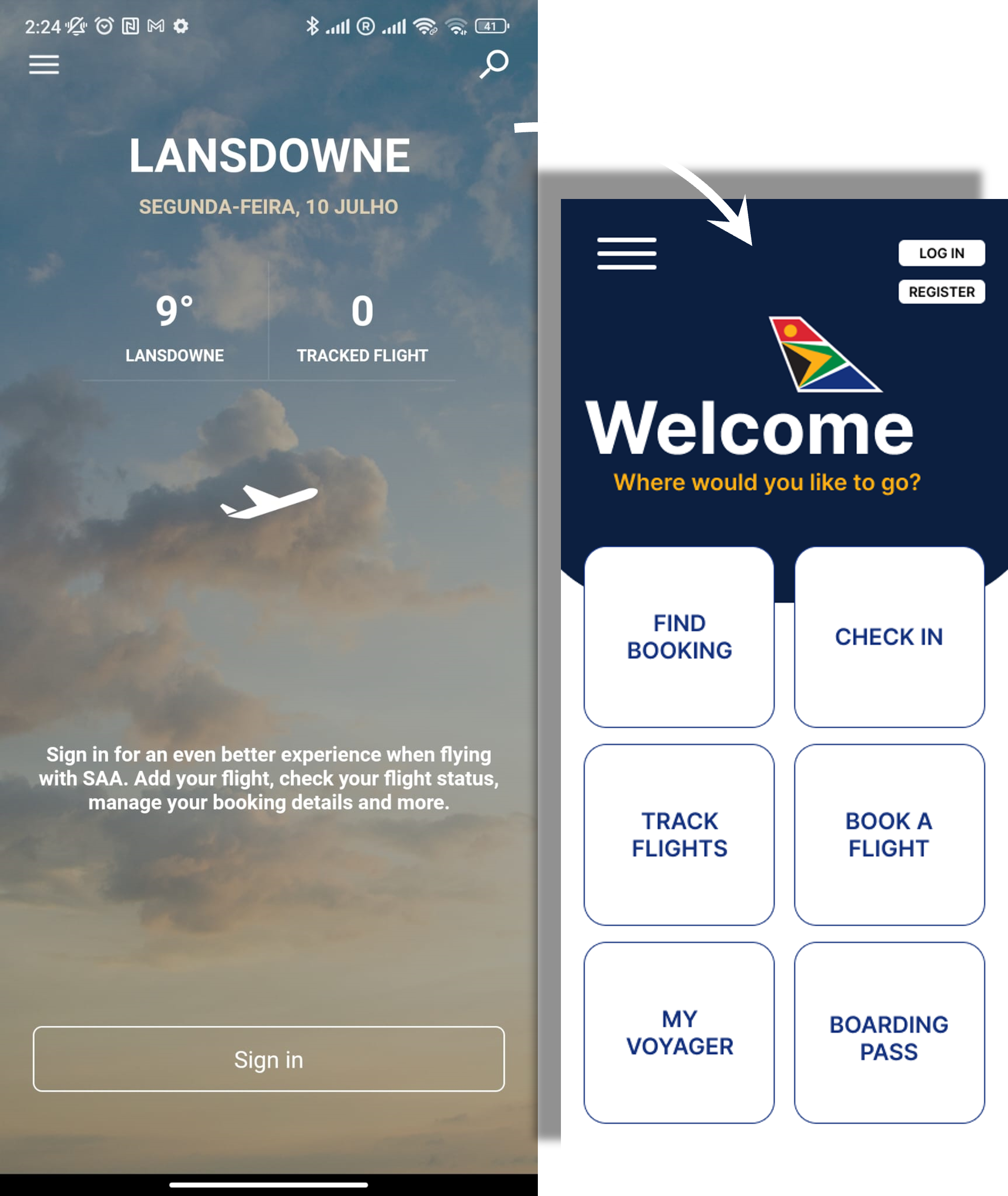
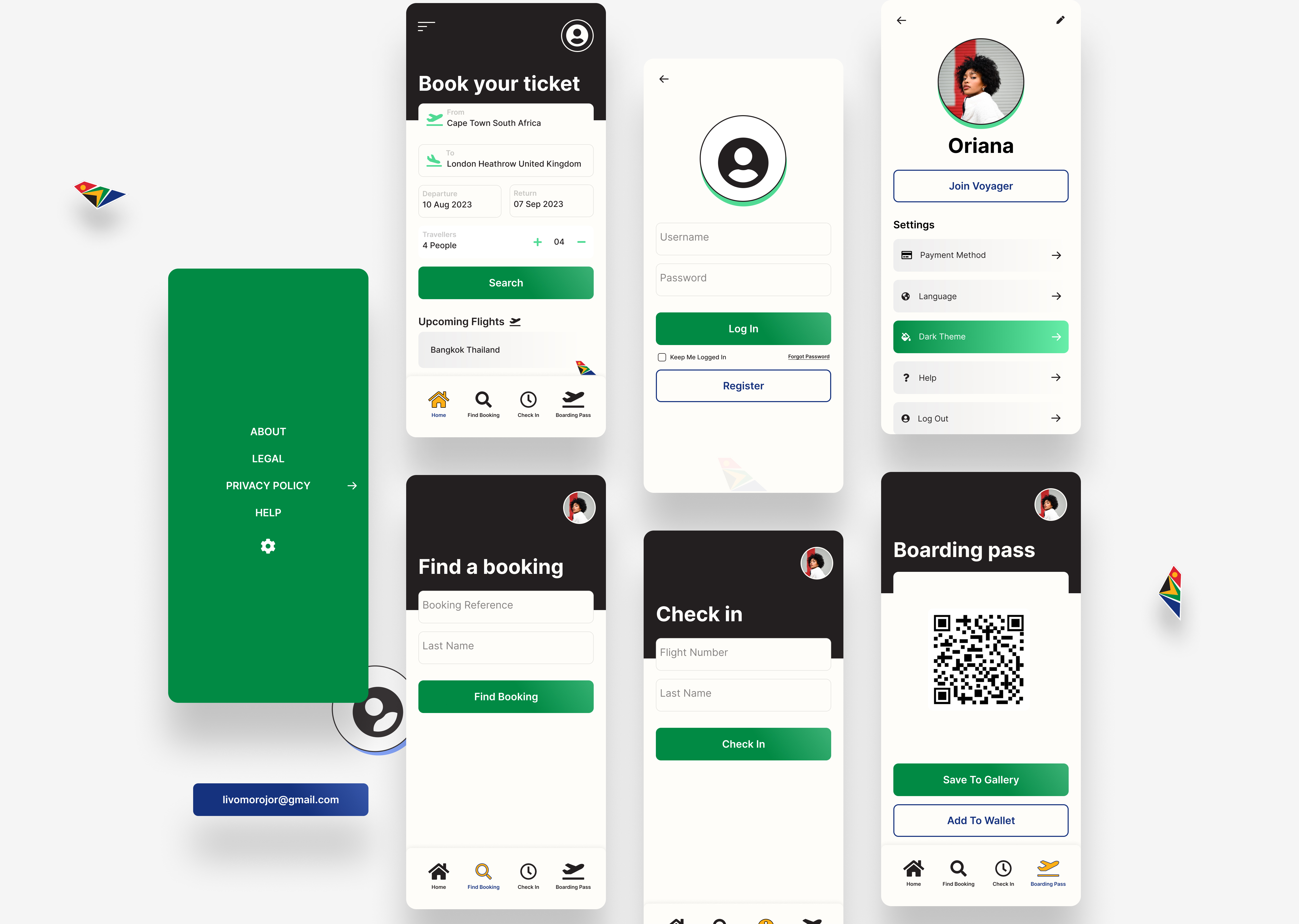
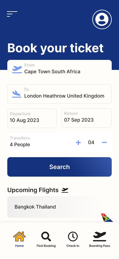
However, after doing extensive research into not only other airline apps but apps that are universally used by people of all ages and levels of computer literacy, I decided to go with a more standard navigation system at the bottom that people have become used to. I could still incorporate all of the main pages that I wanted on the home screen in the navigation.
My design process for this project was interesting because I didn’t follow the traditional steps, but it was all part of the learning process. I had an idea and just dumped them into mid-fidelity designs, this then helped me to see problems and what I needed to change easily. I then went back to the drawing board and created wireframes based on my research about the navigation system and other successful airline apps.
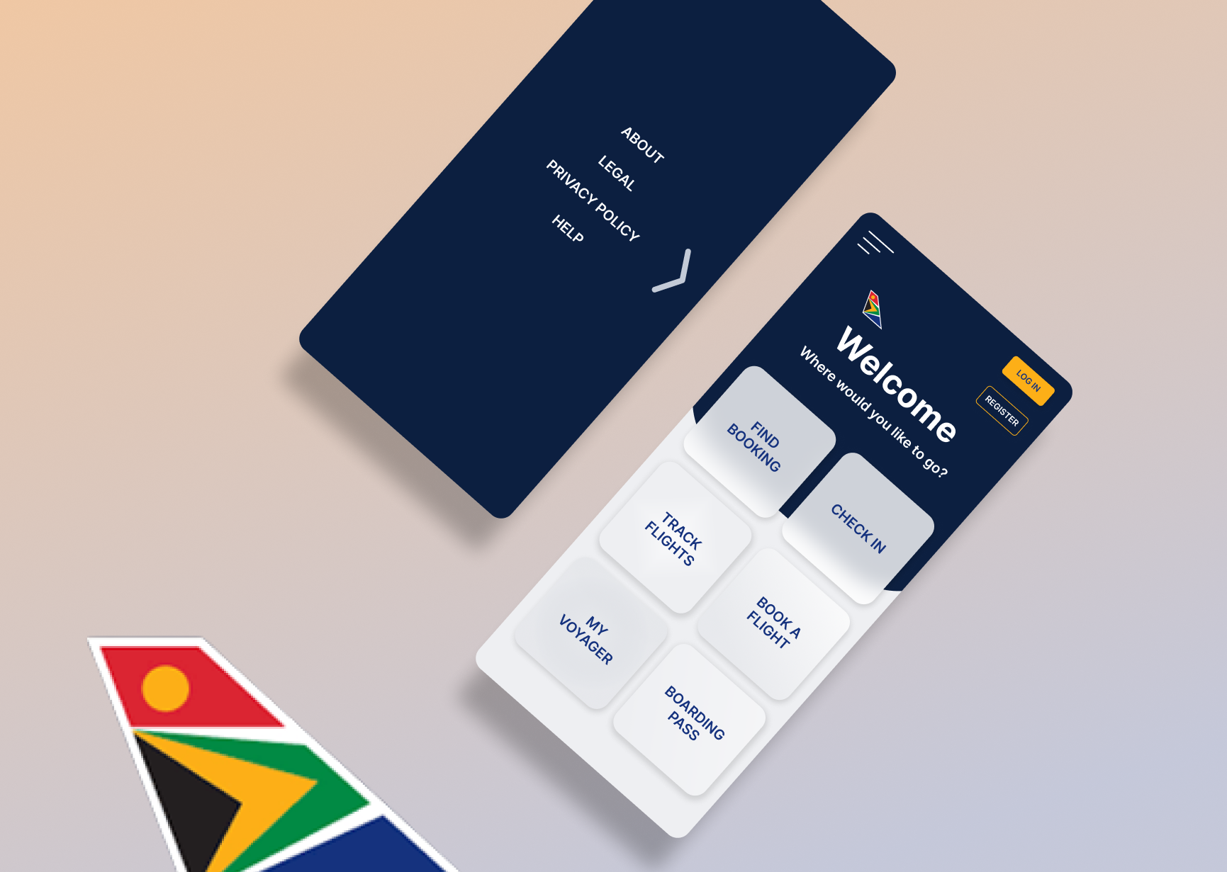
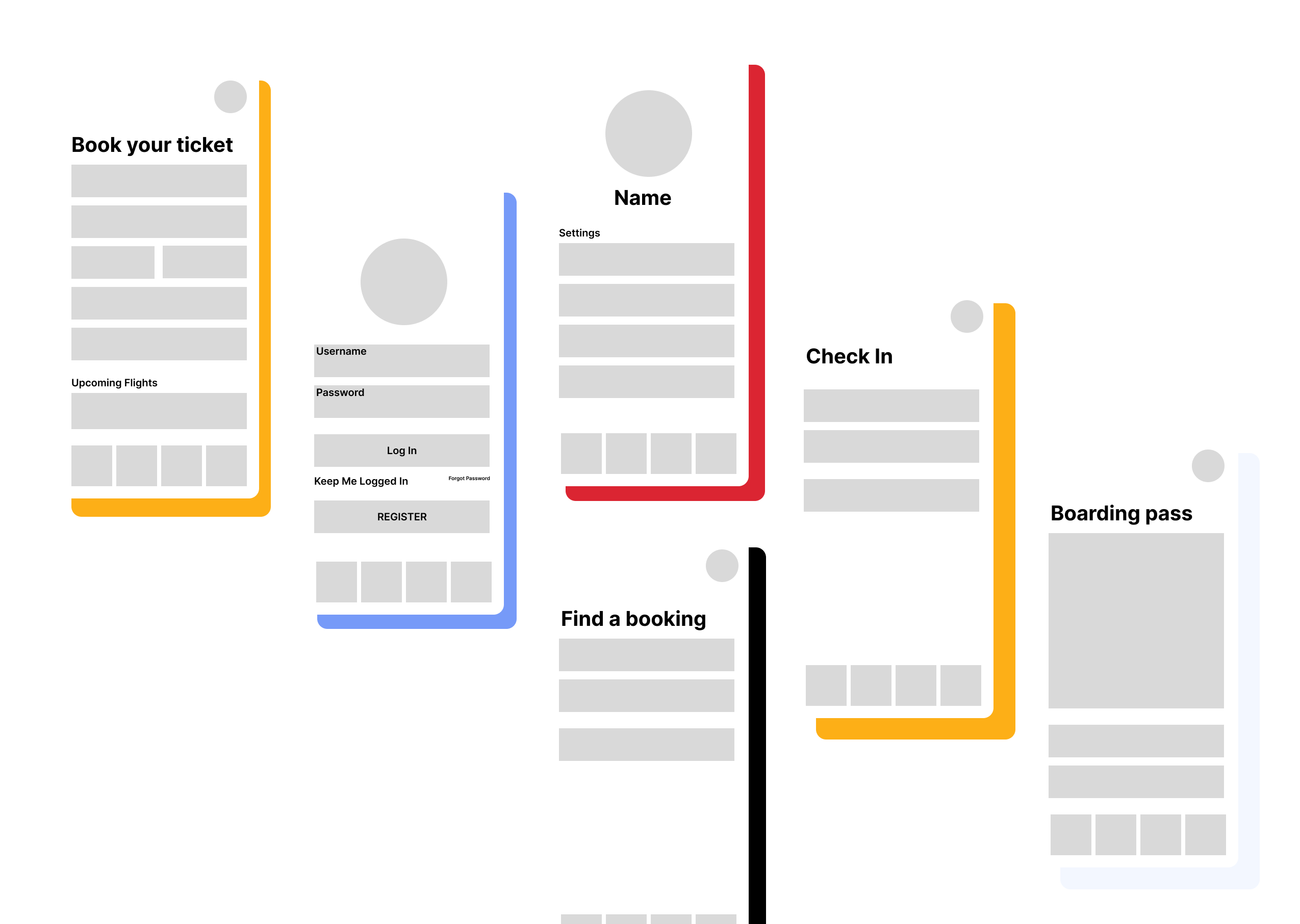
From the wireframes it was then very easy to convert them to high fidelity mockup designs.
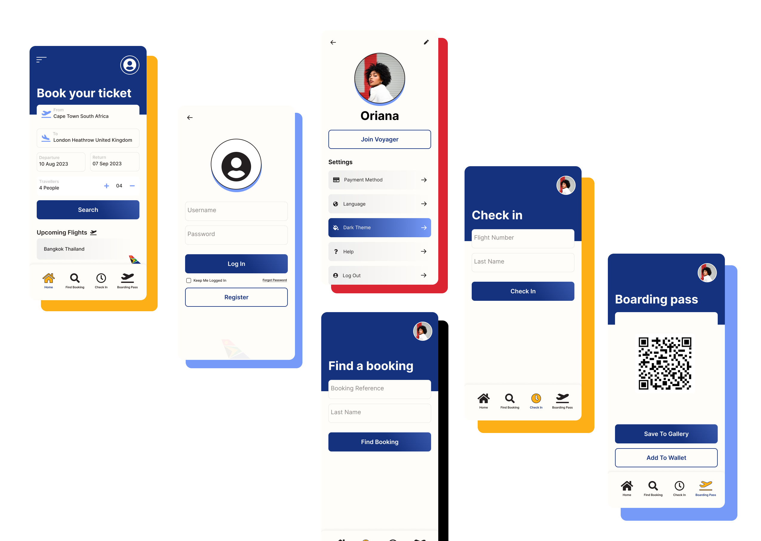
As you can see, I made the design clean, simple, and easy to navigate. When you are preparing for a flight, it can be stressful, so it helps when the airline app is as smooth and calming as possible.
I chose dark blue as the background because blue is a calming colour, and it is also one of the colours in the SouthAfrican Airways logo. I then used yellow for the accent colour as it stands out and is also in the logo colours.